
Marketing Focus: Pantone Color of The Year
Date posted: 25th February 2025 in Apparel
Last updated: 25th February 2025

On an annual basis the experts at Pantone select The Pantone Color Of The Year. Their selection process is based on rigorous trend analysis: They research a massive amount of material including the entertainment industry (films and television), art collections and new artists, design, and fashion as well as new lifestyles, sports and playstyles and socio-economic conditions. Other influences come from the worlds of technology, materials, and textures. Pantone’s Color of The Year has influenced product development and purchasing decisions in multiple industries for over twenty years, including fashion, furnishings and industrial design, as well as product packaging and graphic design.
Pantone has long maintained that color "has always been an integral part of how a culture expresses the attitudes and emotions of the times”. The magical psychological effects of color are sometimes taken for granted but when you consider them, they are so obvious – which is why businesses and organizations should always think carefully not just about the lettering or shape of their logo but their whole brand identity color.
Red, for example, and other colors in the red area of the spectrum (such as orange and yellow) are warm colors and reflect emotions of comfort, joy, fun and confidence. Red itself is a stimulant and encourages appetite (think McDonalds) and urgency (department store closing down sales). Colors over on the blue side of the spectrum (including purple and green) are cool and calm. They reflect maturity, professionalism, earthiness, and intelligence. Blue itself promotes trust and security, while green is used by businesses to suggest harmony and leads to decisiveness. Amazing, isn’t it?
Who is Pantone and what is Pantone?
But, back to the topic at hand. You’re probably asking, “Who are Pantone and what gives them the right to pick the Color of The Year!?”
Pantone began as a printing company in New Jersey in the 1950s (though it was initially named something else). By the mid-1960s the company had developed a system for simplifying stocks of pigments and production of colored inks. This led to the formalization of the Pantone Matching System – a standardized color reference which means every single print can be exactly the same, in color terms. The PMS is now globally recognized. It makes printing so much easier, but how does it work?
Every shade of every color has its own code which can be matched up identically between the design and print stages of a job, regardless of the use of different pieces of equipment – so, ultimately, it maximizes accuracy across that industry. As of 2019, the Pantone system had an incredible 2161 colors within it. Imagine being a printer and trying to mix exactly the right colored ink over and over again to match up between jobs!
Color Of the Year
The Pantone Color of The Year is chosen for the following year. The color is picked to connect with life, so it’s directly influenced by the global zeitgeist (the mood of the times). In 2011 Pantone picked Honeysuckle as Colour of The Year and a representative said "In times of stress we need something to lift our spirits. Honeysuckle is a captivating, stimulating color that gets the adrenaline going – perfect to ward off the blues”.
Pantone View is a lifestyle color trend forecast publication which consumer-oriented companies buy annually to help guide designs and planning for their future products during the next year. It’s in this publication that Pantone focuses on their Color of The Year and offers industries across the globe a source point for inspiration.
How do Pantone colors affect my business, organization, or campaign?
Color is a major part of your brand identity, and the smartest companies knew this when they got their logo designed. Color branding for promotional items is a crucial. Really, color is an extra-special language in branding for companies. It’s a way you can use to ‘secretly’ say something about yourself. Whether it’s red (“Buy me, buy me now!”) or blue (“Trust me, I know what I’m doing”) or any of the other Pantone colors, you can be sure that your customers, clients, and friends are picking up extra messaging.
So, the message to you is: Think about color!
The added brand awareness value in exactly matching colors across items is immense. At EverythingBranded used the Pantone system, so if you know your Pantone color palette, we can get everything on the printed promotional items we do for you ‘just perfect’. We can match up every single piece you order through us. How can you find out your numbers? Ask your designer.
Color at EverythingBranded
As you’ll know with even just a short browse around our website, EverythingBranded is incredibly well stocked with printed promotional products crying out for your logo: T-shirts, mugs, pens, keychains, hats, bottle openers, sunglasses… The list is almost endless. Take a look for yourself!

Strengthen your brand perception with promotional products
Chat online or call us today on 1800-586-1615
More Articles

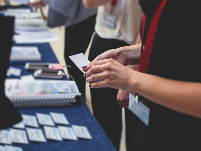
5 Mistakes to Avoid When Ordering Promotional Products
19th August 2025 in Apparel
How to Brand Big with Trade Show Apparel
7th September 2022 in Apparel
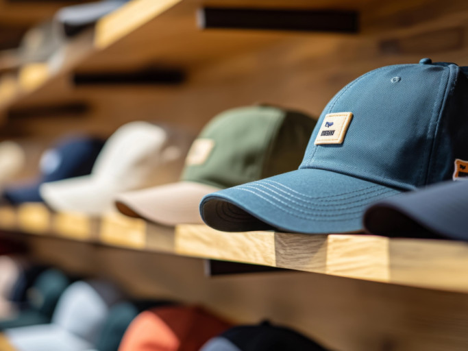
5 Questions to Ask When You're Choosing Custom Promotional Hats
10th February 2025 in Apparel
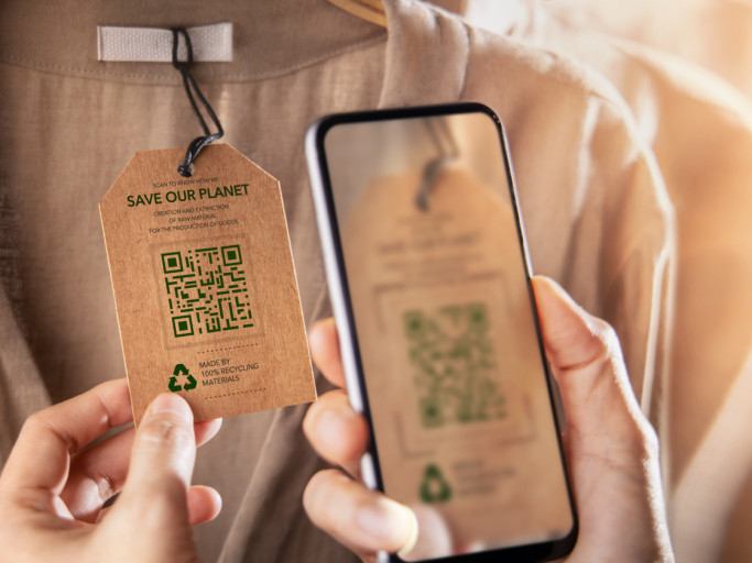
Top Corporate Apparel Trends You Should Know
24th March 2025 in Apparel