

Home / Blog / Marketing & Branding Advice / Pantone Color: How to Stay Peachy in 2024 with Your Promotional Product Advertising
Pantone Color: How to Stay Peachy in 2024 with Your Promotional Product Advertising
Date posted: 11th December 2023 in Marketing & Branding Advice
Last updated: 29th December 2023
As we embrace 2024, businesses are looking for fresh and innovative ways to keep their advertising vibrant and effective. One key element in achieving this is the strategic use of color, and there's no better guide than the Pantone Color System. For 2024, let's focus on a particular hue that's capturing attention: a delightful shade of peach. In this blog, we’ll explore how your business can utilize this trending Pantone color to make your promotional products stand out and keep your advertising feeling "peachy."
The Power of Pantone
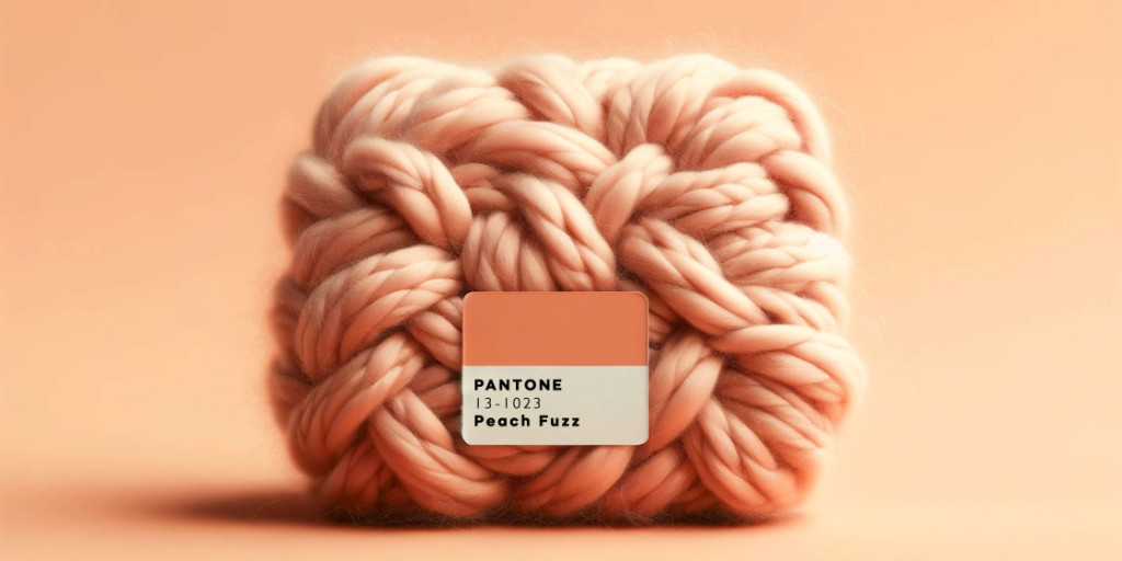
Pantone is the global authority on color and provider of professional color standards for the design industries. Each year, Pantone announces a "Color of the Year," which influences product development and purchasing decisions in multiple industries, including fashion, home furnishings, and industrial design. For 2024, the focus is on a peach hue - a warm, inviting, and versatile color that resonates with feelings of comfort, positivity, and modernity.
Why “Peach Fuzz” in 2024?
Peach is a color that combines the energy of orange with the softness of pink. It is versatile and can be used in various applications, making it an excellent choice for promotional products. The choice of a peach hue for 2024 reflects a trend towards colors that convey optimism and a sense of approachable warmth. In a world where consumers are increasingly seeking authenticity and connection, peach can be the perfect ambassador for your brand’s message.
Incorporating Peach into Your Promotional Products
- Understand the Psychology of Peach: The color peach in promotional product marketing and logo design is often associated with warmth, approachability, and a soft, inviting presence. This hue, a blend of pink and orange, carries connotations of friendliness and sincerity, making it an excellent choice for brands aiming to convey a sense of comfort and accessibility. In color psychology, peach is seen as nurturing and supportive, fostering a gentle connection with the audience. It's particularly effective in industries that prioritize care, wellness, and customer service. When used in logo design, peach can set a brand apart with its unique blend of energy (from orange) and tranquility (from pink), creating a balanced, harmonious image that appeals to a wide audience. Its understated yet warm presence in promotional materials can evoke positive feelings and a sense of trust, making it a strategic choice for companies looking to establish a welcoming and reassuring brand identity.
- Use Peach Strategically: Using the color peach in promotional product marketing can be a strategic choice, appealing to a broad audience due to its soft, warm, and friendly connotations. Peach exudes a sense of approachability and comfort, making it ideal for products that aim to convey a sense of wellness, calm, or approachability. This color can be particularly effective in health and beauty industries, where it resonates with themes of care and gentleness. Moreover, peach can stand out in a market saturated with bold colors, attracting attention without being overpowering. It's also versatile, pairing well with both pastel and vibrant color schemes, enhancing visual appeal. When used thoughtfully, peach can evoke positive emotions, making it a subtle yet powerful tool in marketing to create a memorable and positive association with a brand or product.
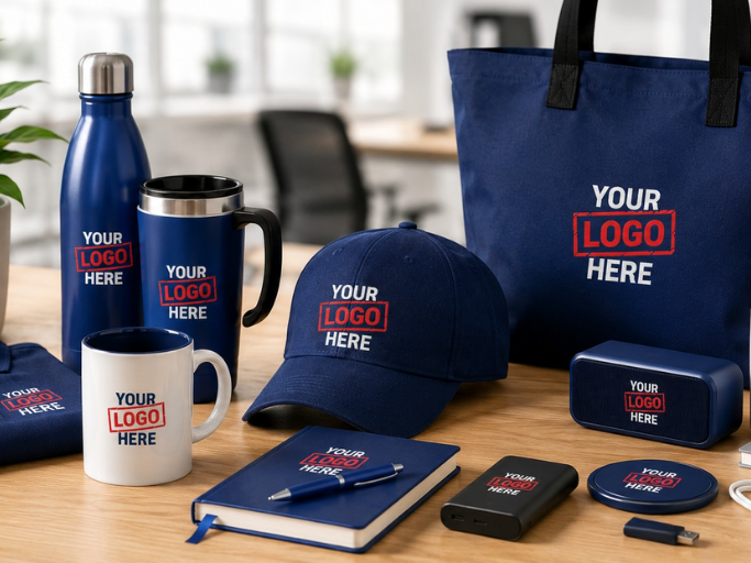
- Choose the Right Products: Some promotional products lend themselves better to the use of vibrant colors like peach. Apparel, office supplies, drinkware, and tech accessories can all be excellent canvases for this hue.
- Keep Design in Mind: The aesthetic appeal of your promotional products is paramount. Ensure that the use of peach in your products aligns with good design principles. It should enhance, not overwhelm, the product’s appearance and functionality.
- Consider Seasonality: Incorporating the color peach in seasonal promotional product marketing campaigns can be highly effective. Peach, with its soft and warm hues, resonates particularly well during spring and summer seasons, symbolizing rejuvenation and vitality. It's a color that can evoke feelings of joy, warmth, and optimism, making it ideal for campaigns during these lighter, brighter months. When used in promotional materials like outdoor event merchandise, seasonal apparel, or limited-edition products, peach can capture the essence of these seasons, drawing a connection between the product and the cheerful, carefree spirit of the warmer months. By aligning the color with the season's mood, marketers can enhance the appeal of their products, making them more attractive and relevant to the target audience. This strategic use of color can lead to increased engagement and a stronger emotional connection with the brand.
Benefits of Using Peach in Your Advertising
- Stand Out in the Market: With its warm and inviting tone, peach can help your promotional products stand out. In a sea of traditional colors, peach can be a breath of fresh air that catches the eye of your target audience.
- Convey a Modern Brand Image: Using a trendy color like peach showcases your brand as modern and up-to-date. It’s a subtle way to communicate that your brand keeps pace with the latest trends.
- Emotional Connection: Colors have the power to evoke emotions. Peach can help create a friendly and positive association with your brand, fostering an emotional connection with your audience.
- Versatility Across Industries: Whether you're in the tech industry, fashion, healthcare, or education, peach is a universally appealing color that can be adapted to various promotional products and marketing materials.
Tips for Implementing Peach in Your 2024 Advertising
- Research Your Audience: Make sure the color resonates with your target demographic. Different colors can have varying effects depending on cultural and personal associations.
- Test Before You Invest: Before rolling out a large batch of promotional products in peach, consider testing a small batch to gauge reception.
- Align with Your Brand Identity: Ensure that the use of peach aligns with your overall brand identity and messaging. Consistency in branding is key.
- Monitor Trends: Stay updated with how color trends evolve throughout the year. Flexibility and adaptation are crucial in responsive marketing.
Embracing the Pantone color of the year, particularly a vibrant and warm shade like peach, can add a fresh and modern twist to your promotional products in 2024. By understanding the psychology behind this choice and strategically incorporating it into your advertising materials, you can create impactful, memorable, and emotionally resonant marketing campaigns. Stay peachy in your advertising efforts and watch how this delightful hue can bring a fresh zest to your brand’s visibility and appeal.

Strengthen your brand perception with promotional products
Chat online or call us today on 1800-586-1615
More Articles
5 Tips For Achieving That #MondayMotivation Every Day
20th August 2018 in Marketing & Branding Advice
Ultimate Custom Corporate Gift Guide for USA Businesses
3rd July 2026 in Marketing & Branding Advice